
In the world of menswear, contrast is the difference between being well-dressed and being unforgettable. It's the visual language that separates the gentleman who simply follows rules from the one who understands that the most compelling style stories are written in opposites.
Beyond Black and White
When most men think of contrast, they default to the obvious black against white, dark against light. But the sophisticated understanding of contrast transcends such thinking. True contrast lives in the unexpected marriage of textures, the deliberate clash of proportions, and the artful mixing of formality levels that creates visual tension without sacrificing elegance.
Consider the formality of a perfectly pressed white shirt against the relaxed luxury of an unstructured cashmere blazer. The contrast isn't merely visual; it's conceptual. Structure meets fluidity. Tradition encounters modernity. The result is an ensemble that speaks to both heritage and innovation, creating depth that catches the discerning eye.
The Language of Texture
Perhaps nowhere is contrast more powerful than in the interplay of textures. The smooth silk of a tie against the rough weave of tweed. The mirror-like finish of patent leather shoes beneath the matte wool of flannel trousers. These juxtapositions create a tactile conversation that elevates even the most traditional silhouettes into something altogether more interesting.
Texture contrast requires confidence. It's about recognising that a chunky knit cardigan can enhance rather than diminish the formality of tailored trousers, creating a sophisticated, casual elegance that speaks to modern sensibilities.


Proportional Play
The art of contrast extends to proportion, where the interplay between fitted and relaxed creates visual intrigue. A sharply tailored jacket over deliberately loose-fitting trousers. A slim-fit shirt beneath an oversized overcoat. These proportional contrasts create a dynamic silhouette that demonstrates both an understanding of classic tailoring and a willingness to challenge conventional expectations.
This approach requires a keen eye for balance knowing when contrast enhances and when it overwhelms. The sophisticated gentleman understands that proportional contrast should feel intentional, never accidental.
Colour Sophistication
While texture and proportion offer subtle forms of contrast, colour provides the most immediate visual impact. But sophisticated colour contrast moves beyond the obvious opposites to explore the nuanced relationships between complementary and analogous hues.
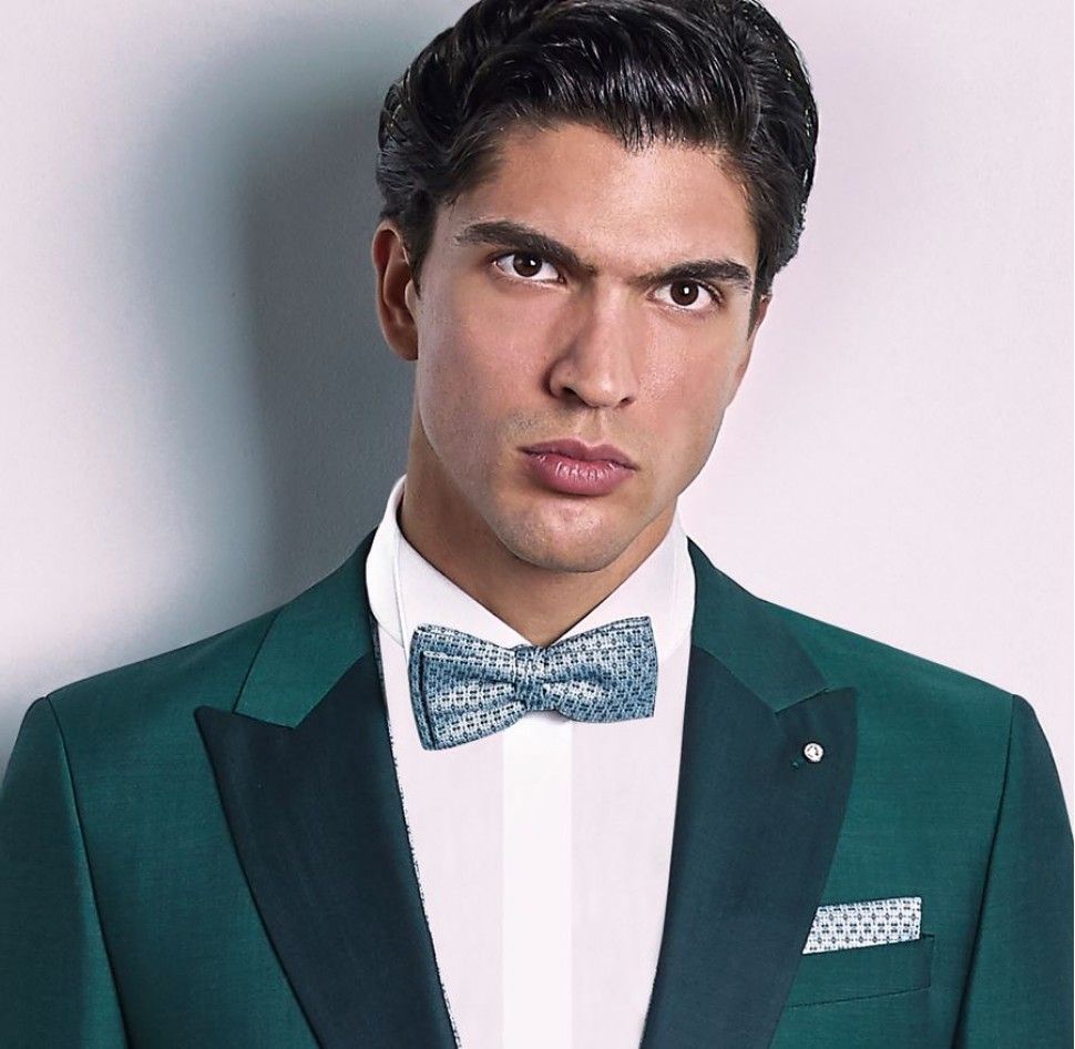
Deep forest green against warm cognac brown. Rich navy paired with burgundy undertones. These combinations create depth and complexity that photographs beautifully while remaining thoroughly wearable. They demonstrate an understanding of colour theory without appearing studied or academic.


The Modern Gentleman's Approach
Mastering contrast requires patience and practice. Begin with one unexpected element perhaps a textured tie with a smooth jacket, or structured shoes with flowing trousers. Build confidence through small experiments before attempting more dramatic juxtapositions.
The key lies in maintaining quality throughout. Contrast amplifies everything, both excellence and mediocrity. When working with opposing elements, each piece must be impeccable in its own right before contributing to the larger composition.
The Confident Choice
The art of contrast is ultimately about confidence the assurance to trust your instincts while respecting the fundamental principles of good dressing. It's about understanding that the most compelling style emerges not from rigid adherence to rules, but from the thoughtful breaking of them.
In a world where conformity often masquerades as sophistication, contrast becomes a form of quiet rebellion. It's the choice to be memorable rather than merely acceptable, distinctive rather than simply appropriate. Master the art of contrast, and you master the language of sophisticated rebellion, speaking volumes without saying a word.


